2024, TrueMoney Regional
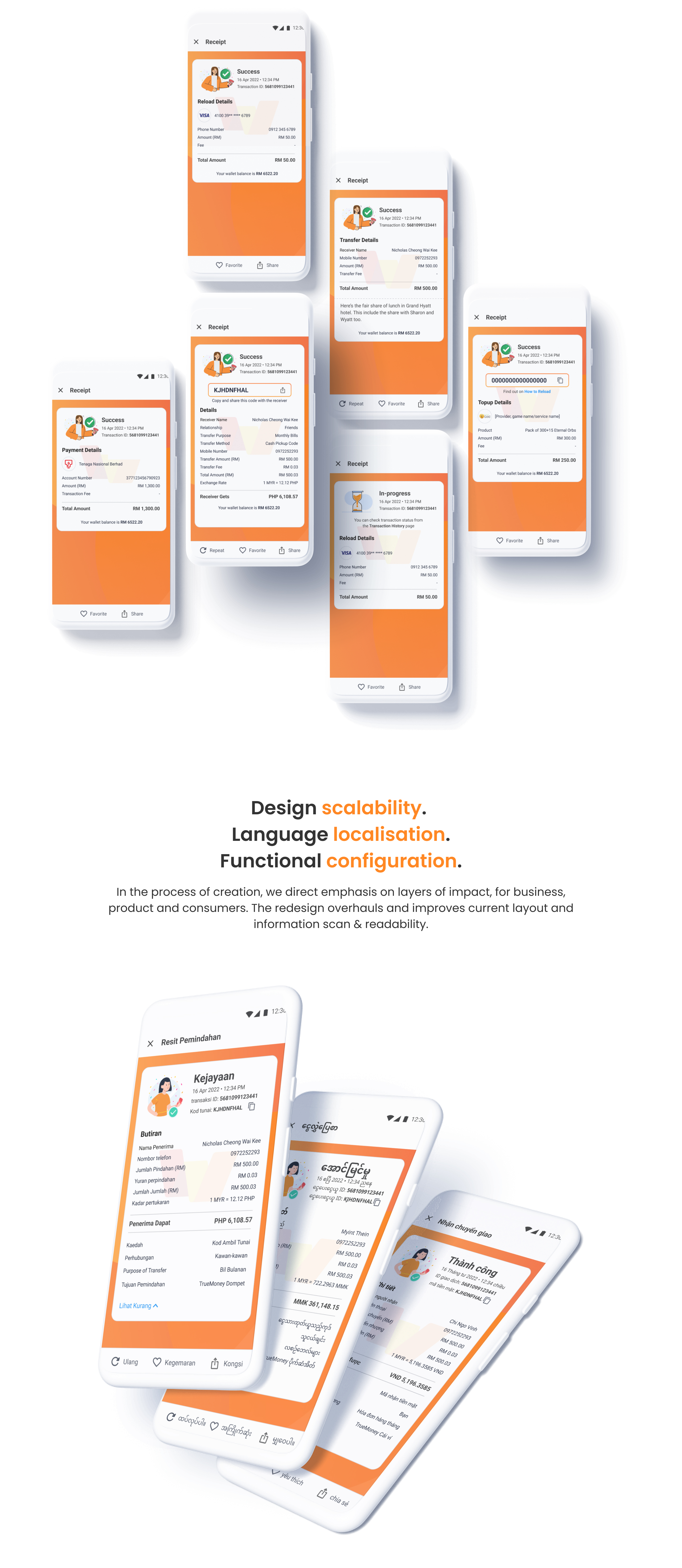
A design overhaul of our TrueMoney Receipt template redefines how we see design scales in regions, in various languages and currency patterns.
The challenge
The current design layout and information presented poor legibility and readability, plus an outdated design pattern since its last redesign. Some other design challenges we see:
• Payment or transaction information takes up 70% of a screen scrolling height. Our users find difficulties in identifying crucial information, for which heavy back-and-forth scrolling interaction persists
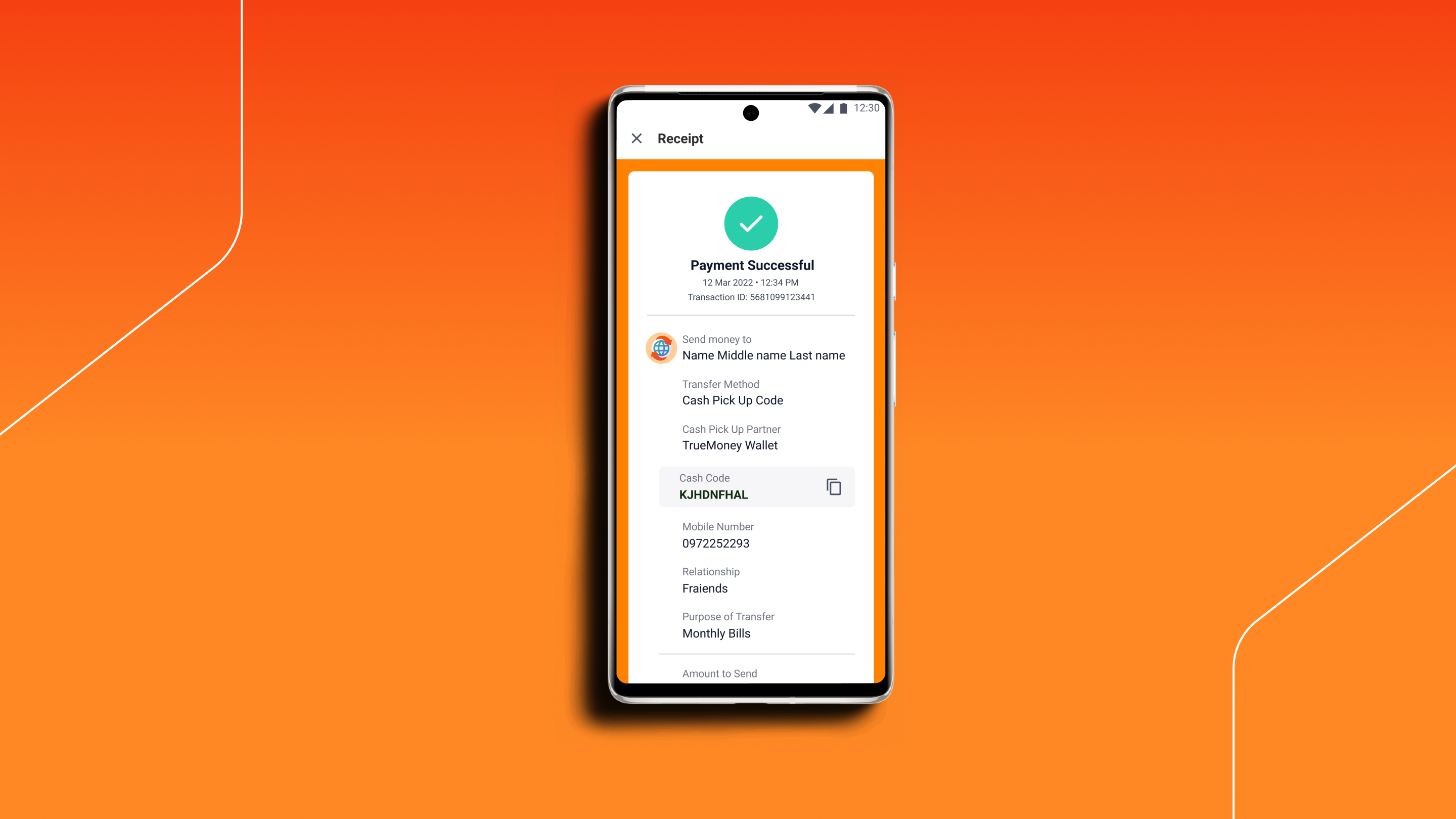
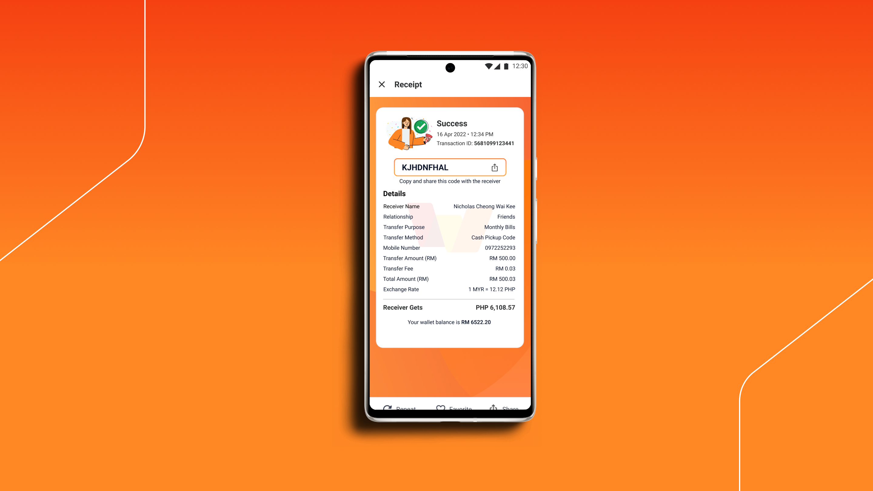
• Important information, like top-up codes and international remittance pickup cash codes, are designed at the same level like any other information, making it difficult for users to identify the importance of such details
• Users find difficulty in identifying the type of transactions (Payment, reload and transfer) when accessing records from transaction history
• Receipts are only generated when a transaction goes through successfully. Unfortunately with TrueMoney, this also applies to failed transactions, which causes our users to be confused about whether money is deducted from their wallets
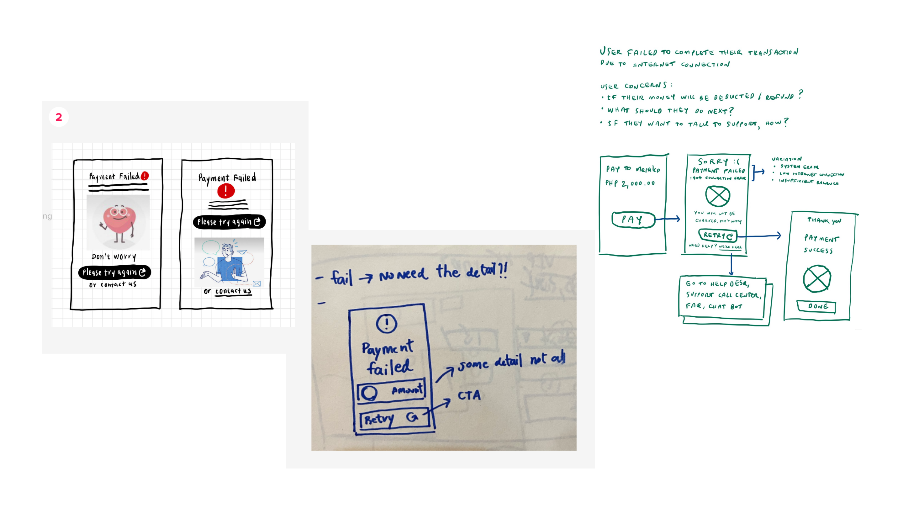
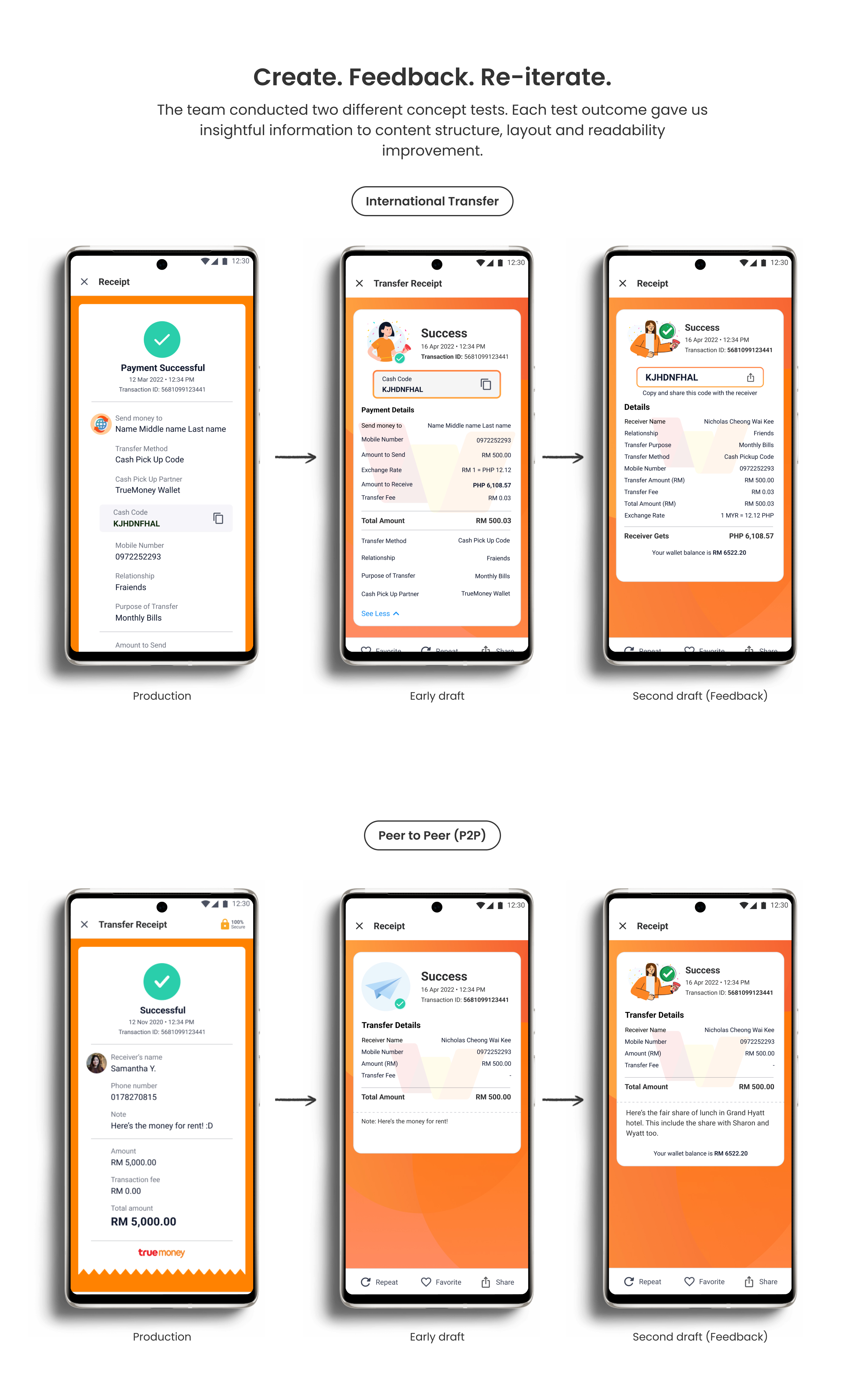
In our Crazy 8s sketch sessions, we drafted a few quick concepts, together with current production designs, to be tested with users for rapid iterate and feedback.
By doing so, we are able to understand and relate the type of information that matters to our users. We also take these into our final design solution.
The delivered solution:
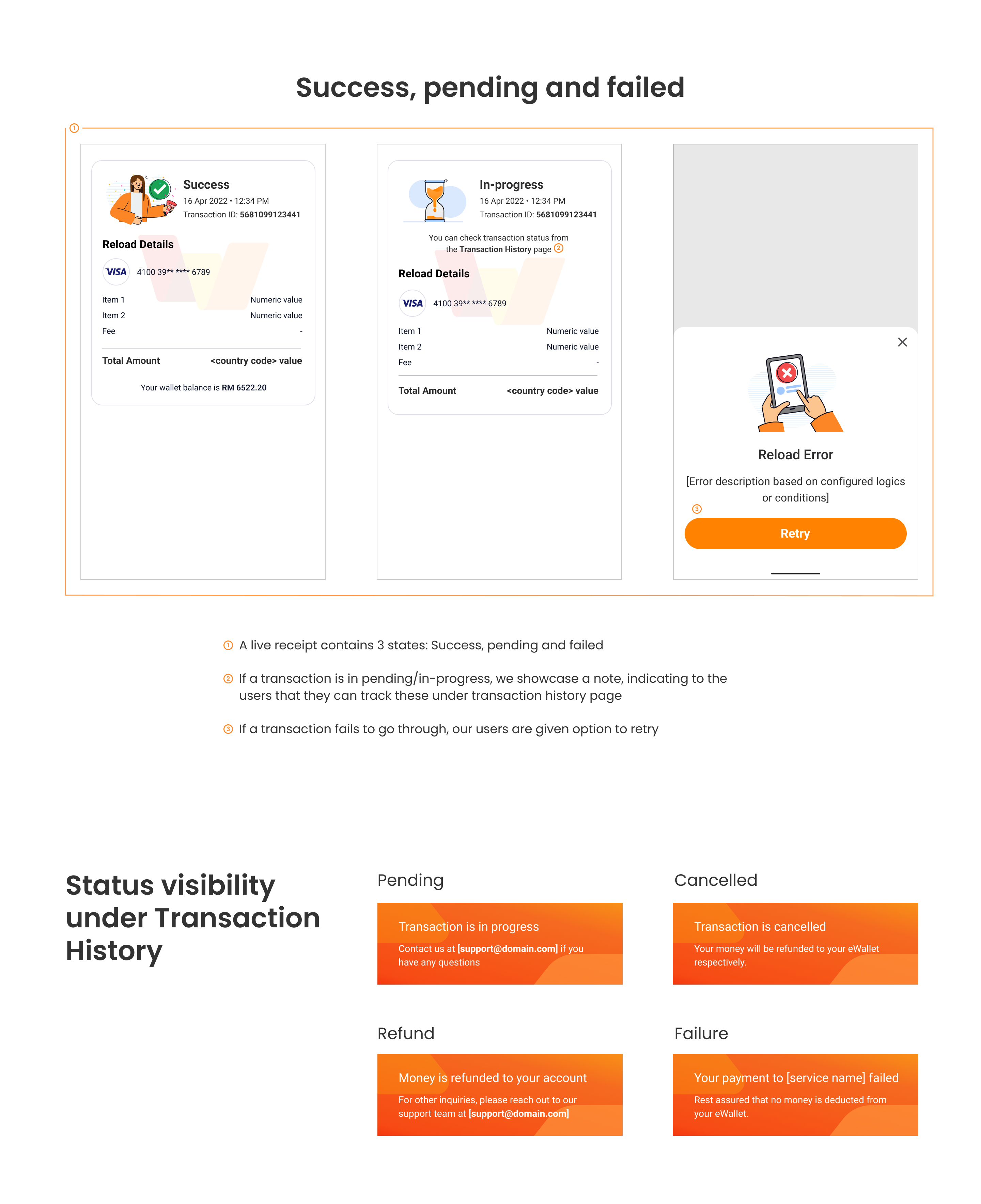
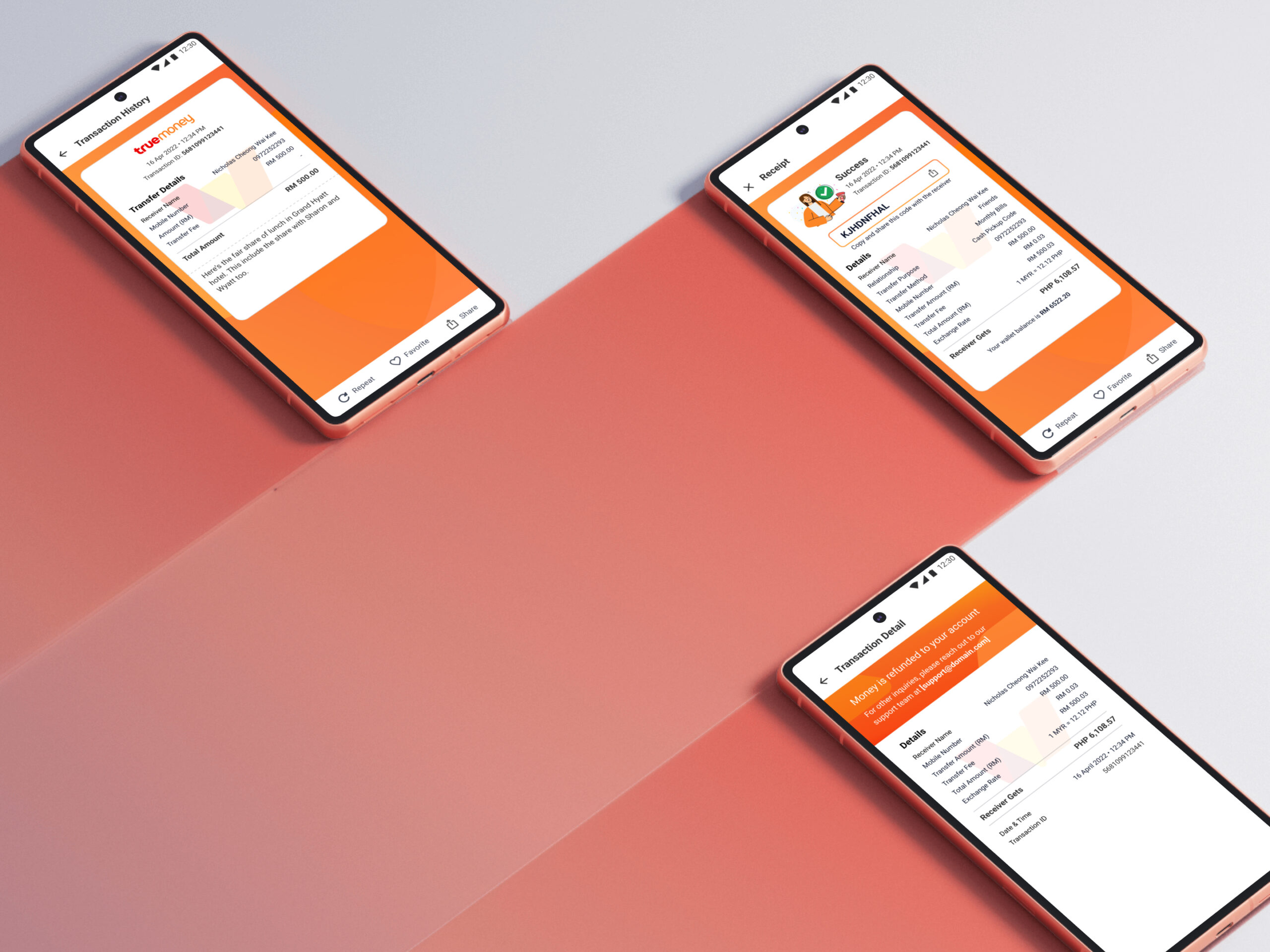
• 3 templates: Live receipt, saved/offline receipt, and log receipt under transaction history
• If a transaction fails to go through, we provide users with an option to retry, provided a prompt or notification for clarity in communication
• Any pending/in-progress transactions status can be tracked in the user's transaction history page
• Remove complex financial terms and jargon, with a humanised touch added to how we communicate to our users. Example: Beneficiary to Receiver, Remit Amount to Transfer Amount
